Mobile-first isn’t just a strategy — it’s survival. In 2025, more than 70% of user interactions happen on handheld devices. People browse, shop, learn, and communicate primarily through smartphones, often while multitasking or moving through their day. If your design breaks on mobile, it breaks your brand’s reputation. A layout that feels clumsy on a small screen signals carelessness, even if the desktop version looks perfect. Responsive design therefore becomes a core part of how users judge your professionalism. It defines how quickly they understand your interface, how comfortable they feel navigating it, and ultimately whether they trust your product.
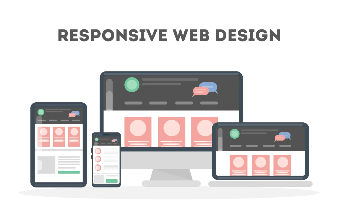
Responsive design is not only about shrinking elements to fit a smaller screen. It is about understanding context. Mobile users interact differently: they scroll more, they rely on gestures, and they expect fast loading times. A responsive interface adapts not just visually but behaviorally, ensuring that each device receives an experience optimized for its constraints and possibilities. The goal is consistency of experience, not identical layouts.
Core Principles
Responsive design begins with empathy. Designers must consider how people physically interact with devices. On mobile, thumbs replace cursors. This means touch targets must be larger, spacing must be comfortable, and important controls should be reachable without awkward hand movements. Interfaces designed with real ergonomics in mind feel natural and intuitive.
Use relative units such as em, %, vw, and ch rather than rigid pixel values. Relative units allow layouts to scale gracefully as screen sizes change. Fluid grids are another key component: instead of fixed layouts, elements should expand and contract in proportion to the available space. This creates visual balance across devices ranging from small phones to large desktop monitors.
Avoid designing strictly for specific devices. Instead of writing device-based media queries, focus on content-driven breakpoints. These breakpoints occur where the layout begins to feel cramped or visually unstable. By responding to the needs of the content rather than the device category, designs become more flexible and future-proof.
Planning for gestures, transitions, and scrolling behavior is equally important. Mobile experiences often rely on vertical flow and intuitive gestures like swiping, tapping, and dragging. Thoughtful animation and smooth transitions can guide the user’s attention without overwhelming them. Respecting user ergonomics and natural interaction patterns improves both usability and perceived quality.
A strong mobile-first approach builds scalability upward, not downward. Instead of designing a complex desktop layout and attempting to compress it for mobile, start with the smallest screen and gradually enhance the interface for larger displays. This approach forces designers to prioritize essential content and functionality first, resulting in cleaner and more focused experiences.
Best Practices
Modern CSS provides powerful tools that make responsive design more efficient and modular. CSS container queries allow components to adapt based on the size of their container rather than the entire viewport. This enables truly reusable interface components that behave intelligently in different layouts.
Testing is critical. Interfaces can behave differently across browsers, operating systems, and device resolutions. Tools like BrowserStack and ResponsivelyApp allow designers and developers to simulate many environments and identify layout inconsistencies early in development. However, real-device testing is still valuable because physical screen density and touch behavior can influence usability.
Avoid horizontal scroll traps whenever possible. Horizontal scrolling on mobile is rarely expected and often breaks immersion. Users instinctively scroll vertically, so content should follow a natural vertical rhythm that maintains flow and readability.
Images should also adapt intelligently. Using srcset and sizes attributes allows browsers to select the most appropriate image resolution for the user’s device. This prevents unnecessary downloads of large images on small screens while still maintaining crisp visuals on high-density displays.
Typography deserves special attention in responsive design. A font that looks readable on a desktop monitor may become difficult to read on a mobile device with high pixel density. Testing font size, line height, and spacing on actual devices helps ensure comfortable reading and accessibility.
Responsiveness is also deeply connected to performance. A page that technically resizes but loads slowly isn’t truly responsive from a user’s perspective. Performance optimization techniques such as lazy loading, dynamic content loading, and viewport-based prioritization can significantly improve perceived speed. When content appears quickly and smoothly as users scroll, the interface feels alive and responsive to their actions.
Responsive design also contributes to accessibility. Flexible layouts help users who rely on zooming, screen readers, or alternative input methods. A responsive interface that adapts to different screen sizes often adapts better to different user needs as well.
Ultimately, responsiveness reflects how much attention a brand pays to its audience. A site that works flawlessly on every device communicates care and competence. In contrast, a site that struggles on mobile signals neglect and outdated practices.
Responsiveness is your brand’s handshake with every visitor — firm, polished, and reliable. When your interface adapts seamlessly to every context, users perceive care, quality, and confidence. A responsive website doesn’t just look good everywhere; it makes users feel understood, respected, and comfortable interacting with your product regardless of the device they use.

